# Don't Tell Typographers
Just because we can doesn't mean we should 
---
Hi 👋, my name is Donnie D'Amato and I'm a Design Systems ~~Addict~~ ~~Antagonist~~ Architect. ## ⚠️ Incoming math
(this is where we draw the line) ## Typography 101
- Letter spacing _should_ be related to font size
- Line height _should_ be related to font size
- Line height _should_ be related to line length
- Body copy _should_ be a maximum of 40 to 80 characters ## Letter spacing _should_ be related to font size 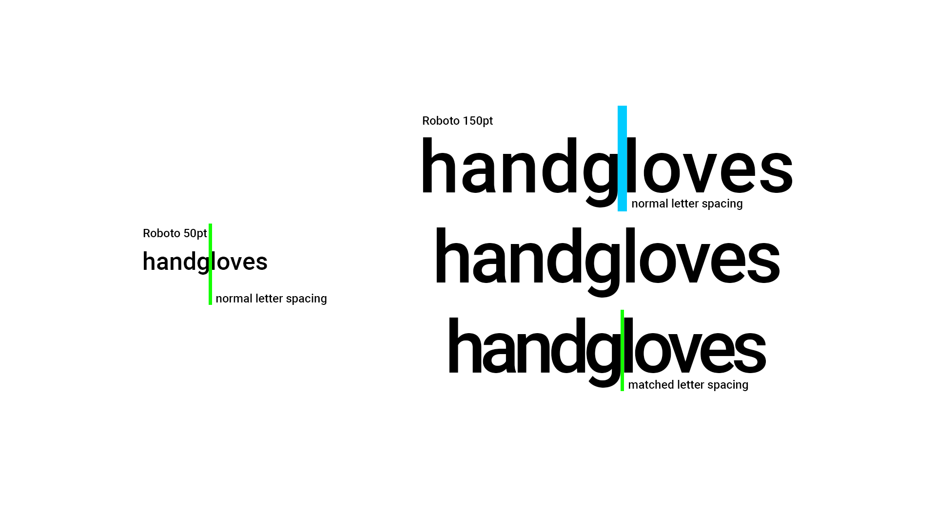 - Body text size ➡️ one letter spacing value
- Heading text size ➡️ another (smaller) letter spacing value
- Linear progression between the values $\text{rate of change} = \Delta \text{space}/ \Delta \text{size}$  $m = (y_2-y_1)/(x_2-x_1)$ $y = mx+b$
$\text{letter spacing} = \text{rate of change}\times\text{font size}+b$ $b = y - mx$ 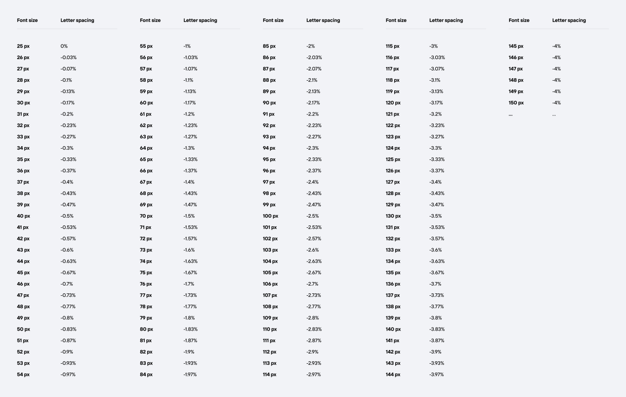 ```css
.text {
--m: calc((-0.01em - 0em) / (28px - 25px));
--b: calc(-0.01em - (var(--m) * 28px));
--y: calc((var(--m) * 28px) + var(--b));
/* --y should be negative */
letter-spacing: min(0em, var(--y));
}
``` `letter-spacing: <length>`
Specifies extra inter-character space in _addition_ to the default space between characters. Values may be negative, but there may be implementation-specific limits.
```css
.text {
/* Does nothing */
letter-spacing: 0em;
}
``` ## How to choose the values
- Choose metrics for your body text and heading text.
- Get the font size ($x$) and letter spacing ($y$).
- Plug into the formulas for a line to find $m$ and $b$.
- Turn into CSS `calc()`. ## ⚠️ Gotcha!
```css
.text {
--value: calc(16px / 1rem);
}
```  ## Line height _should_ be related to font size 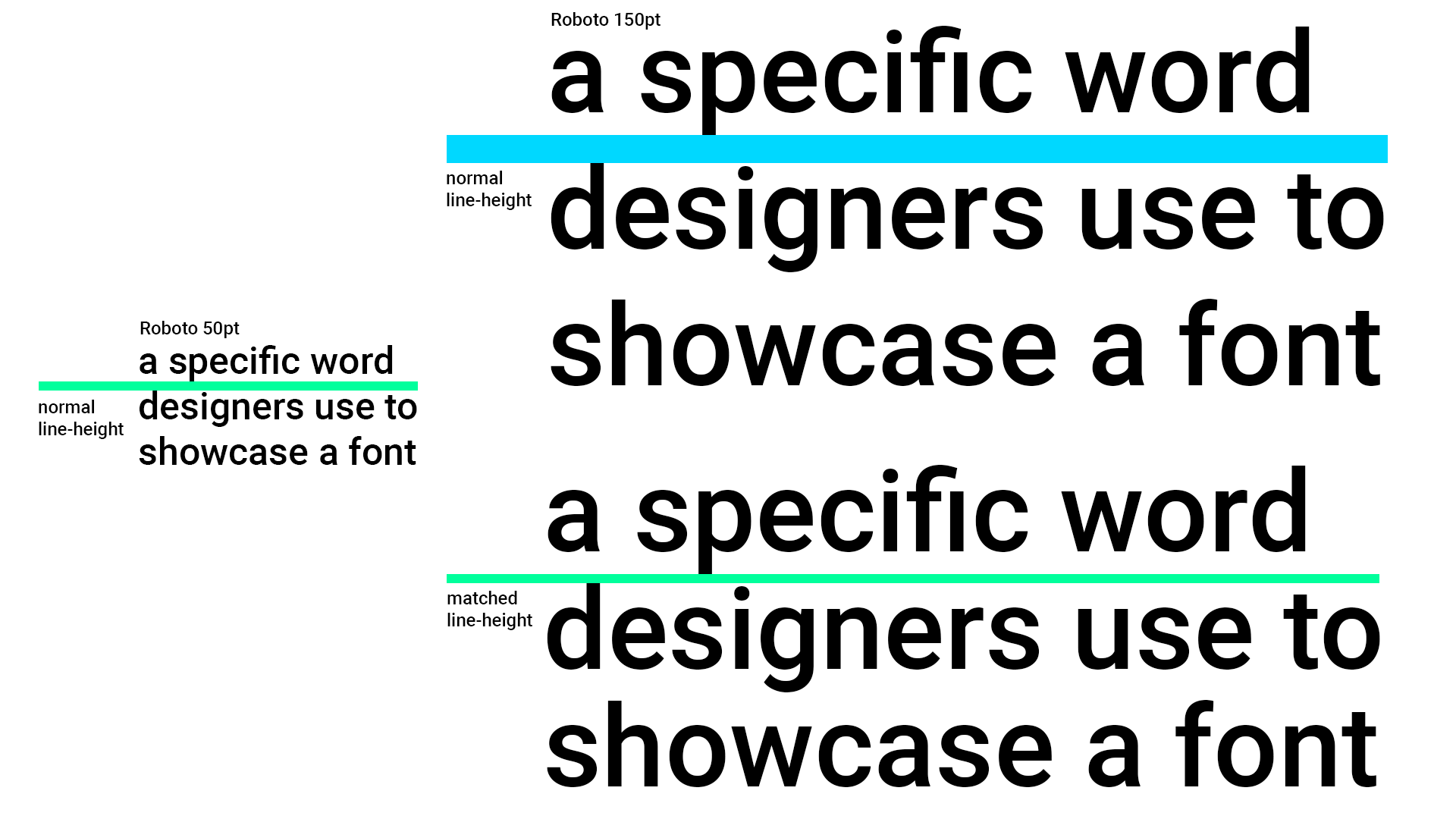 ```css
.text {
/* different values from earlier */
--m: calc((1.2em - 1.5em) / (2.5rem - 1rem));
--b: calc(1.2em - (var(--m) * 2.5rem));
--y: calc((var(--m) * 2.5rem) + var(--b));
line-height: min(1.5em, var(--y));
}
``` ## Grid aligned line-height
- `font-size: 28px; line-height: 32px;`
- `font-size: 18px; line-height: 24px;` ## Grid aligned line-height
```css
.text {
line-height: round(
up,
min(1.5em, var(--y)),
var(--grid-unit, 8px)
);
}
``` ## A small font size change could produce a large gap between lines. ## Line height _should_ be related to line length - [Pimp My Type](https://pimpmytype.com/line-length-line-height/) “Longer lines need more line height, shorter lines need less.”
- [Typographic Web Design](http://www.typographicwebdesign.com/setting-text/font-size-line-height-measure-alignment/) “Depending on the amount of text, the line length, the font size, and the size of a font’s x-height, you may find that the line height needs to be tightened or loosened slightly to promote comfortable reading.”
- [Google Fonts Knowledge](https://fonts.google.com/knowledge/using_type/choosing_a_suitable_line_height) “There’s no secret formula for setting the “right” line height for type. It’ll depend on the font, the size it’s set at, the length of the line, and the overall reading context”
- [Typographic Design Patterns And Best Practices](https://www.smashingmagazine.com/2009/08/typographic-design-survey-best-practices-from-the-best-blogs/) “Leading (or line height) will always depend on your chosen font size and measure (or line length).” ## 😵 ## Container queries?
At this width, do this... ## Container query units?
Percentage of container dimension ## We need the _width_ of the container
Not a specific point. Not a percentage. We need the actual width.  ```css
@property --_x {
syntax: "<number>";
inherits: true;
initial-value: 0;
}
@property --ch {
syntax: "<integer>";
inherits: true;
initial-value: 0;
}
@keyframes x { to { --_x: 1} }
``` ```css
.text {
--ch: calc(1/(1 - var(--_x)));
timeline-scope: --cx;
animation: x linear;
animation-timeline: --cx;
animation-range: entry 100% exit 100%;
&::before {
content: '';
width: 1ch;
view-timeline: --cx inline;
}
}
``` <iframe height="600" style="width: 100%;" scrolling="no" title="Line-height based on line length" src="https://codepen.io/fauxserious/embed/VYwYjJx?default-tab=css%2Cresult" frameborder="no" loading="lazy" allowtransparency="true">
See the Pen <a href="https://codepen.io/fauxserious/pen/VYwYjJx">
Line-height based on line length</a> by Donnie D'Amato (<a href="https://codepen.io/fauxserious">@fauxserious</a>)
on <a href="https://codepen.io">CodePen</a>.
</iframe> (bonus!)
## _Web_ Typography 101
- Heading size _should_ decrease on smaller devices ## Why? 🤔 ## LooksGood™
This isn't repeatable 👎 ## Typography 101
- Letter spacing _should_ be related to font size
- Line height _should_ be related to font size
- Line height _should_ be related to line length
- Body copy _should_ be a maximum of 40 to 80 characters 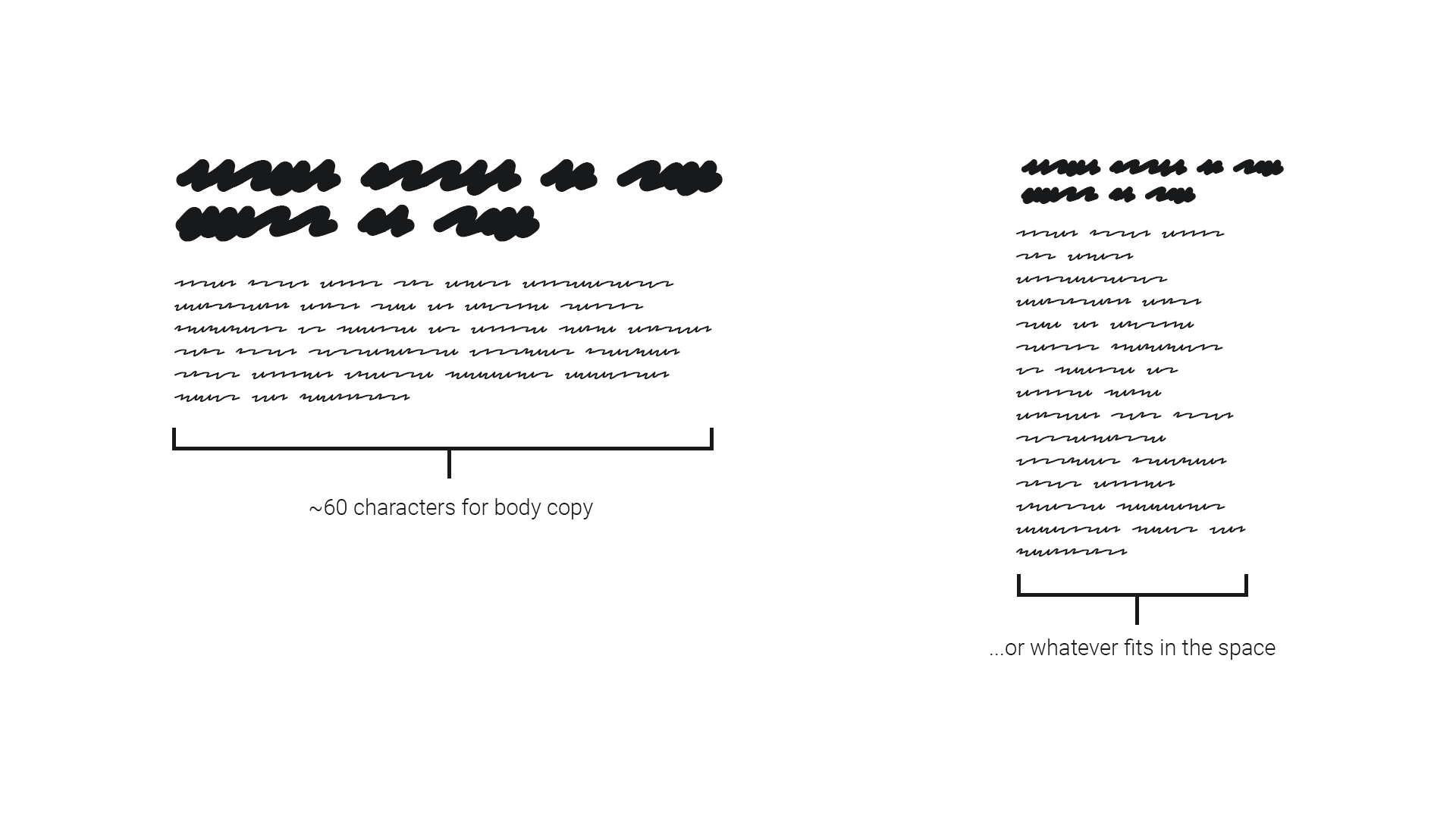 ## Hypothesis
- The heading font "lockup" _should_ be harmonious with the body copy.  - Heading maximum width of ~60 body copy characters (`60rch`).
- Heading minimum width of `320px` (smallest device size).
- Heading scales down propotionally between these sizes.
- Heading largest size should be "desktop".
- Heading smallest size should maintain visual hierarchy with body copy. ```css
.heading {
--heading-largest: 2.5rem;
--heading-smallest: 1.2rem;
font-size: clamp(
var(--heading-smallest),
/* more to come */,
var(--heading-largest)
);
}
``` $m = (y_2-y_1)/(x_2-x_1)$ ```css
.heading {
--heading-largest: 2.5rem;
--heading-smallest: 1.2rem;
--m: calc(
(var(--heading-largest) - var(--heading-smallest))
/ (60rch - 320px)
);
font-size: clamp(
var(--heading-smallest),
/* more to come */,
var(--heading-largest)
);
}
``` ```css
.heading {
--heading-largest: 2.5rem;
--heading-smallest: 1.2rem;
--m: calc(
(var(--heading-largest) - var(--heading-smallest))
/ (60rch - 320px)
);
font-size: clamp(
var(--heading-smallest),
var(--m) * 100vw,
var(--heading-largest)
);
}
``` 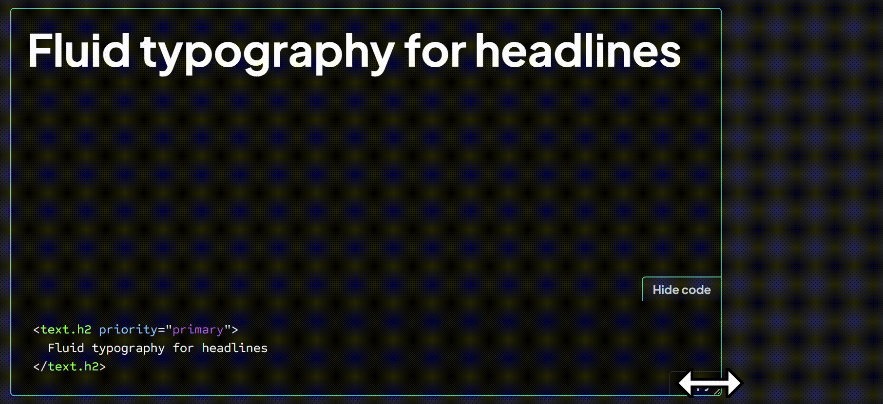 ## To do thoughtful typography on the web, you need math ## Easy mode
```css
body {
line-height: 1.5;
}
:where(h1, h2, h3) {
line-height: 1.15;
/* https://fluid.style */
font-size: clamp(1.2rem, 1.15rem + 1.8vw, 2.5rem);
}
``` ## Thank you 🙏
[donnie.damato.design](https://donnie.damato.design)
(available for professional consulting)
---